Logo Design | Website Development
CLIENT: BRAZING ALLOYS
DATE: AUGUST 2023
THE BRIEF:
Three ambitious entrepreneurs came together to launch an in-demand product line of brazing alloys.
With years of industry experience under their belt and the world’s leading supplier in their back pocket, they needed to build a striking brand identity and easy to navigate website platform in order to launch the business.
OUR OBJECTIVES:
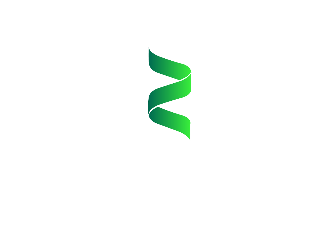
We wanted to keep the branding vibrant but clean. Something that represented the neon glowing heat emitted during the brazing process.
We also wanted to indicate some kind of seamless joining in the logo.
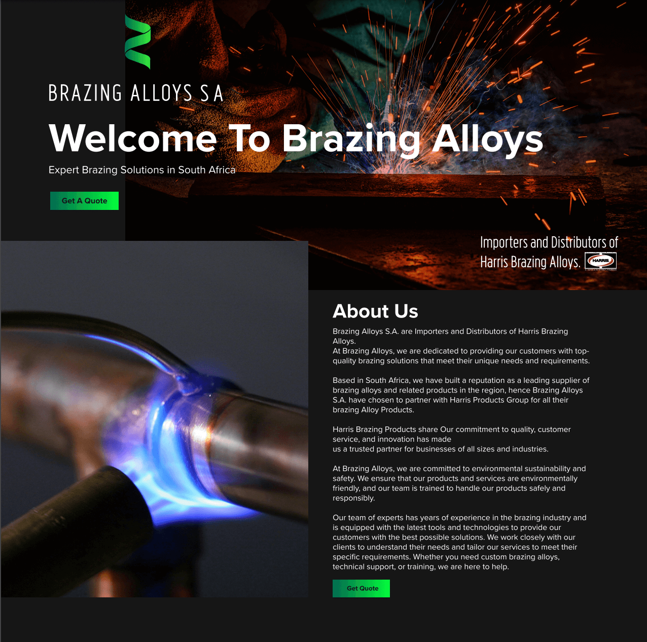
The website was designed as an entry-level single pager. Enough to establish the business and easy on a start-up budget too.
DESIGN CONCEPT MOODBOARD
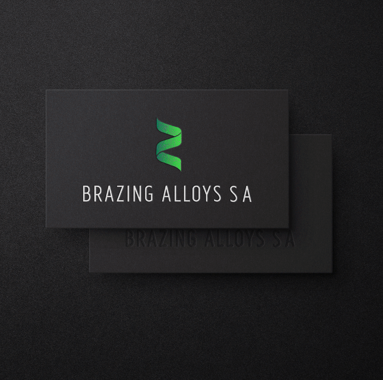
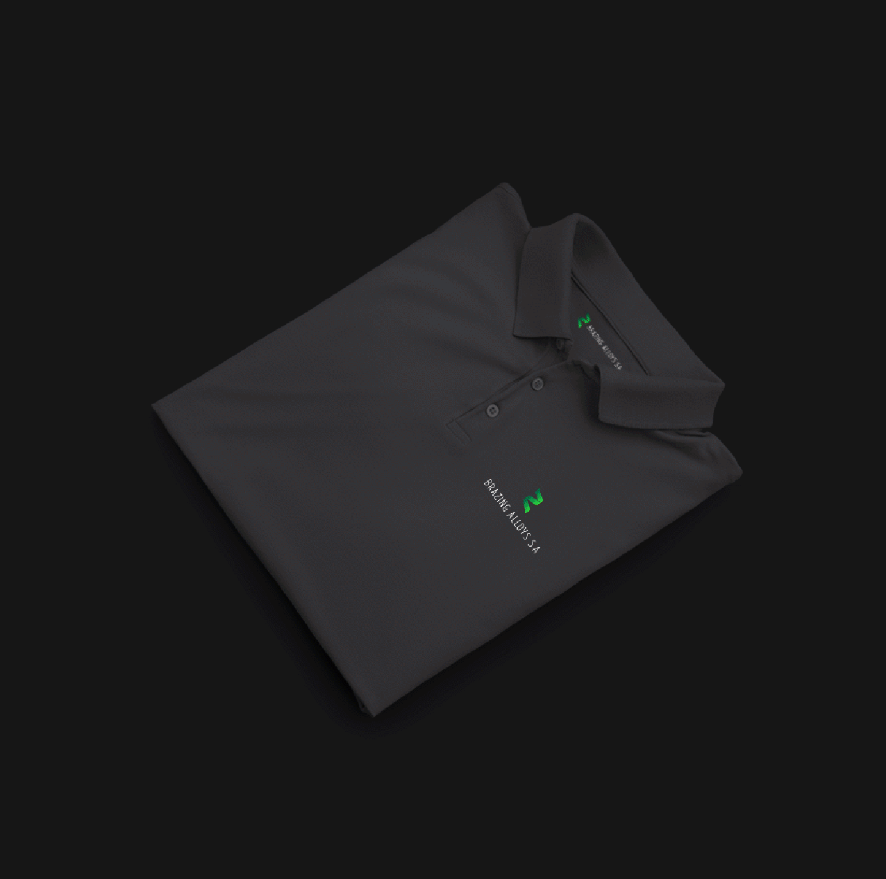
THE LOGO
OVERVIEW
We decided to steer away from too much red and rather focus on the luminescent green that represents an extreme heat. It also was the perfect contrast on the dark website design we had started working on alongside their logo design.
FONT
The client wanted a clean, slim font that was easy to read and wouldn’t look bulky.
ICON
The icon reflects unnoticeable joints and rising heat. We also wanted to bring in an element that showcased the brand’s importance on sustainability.