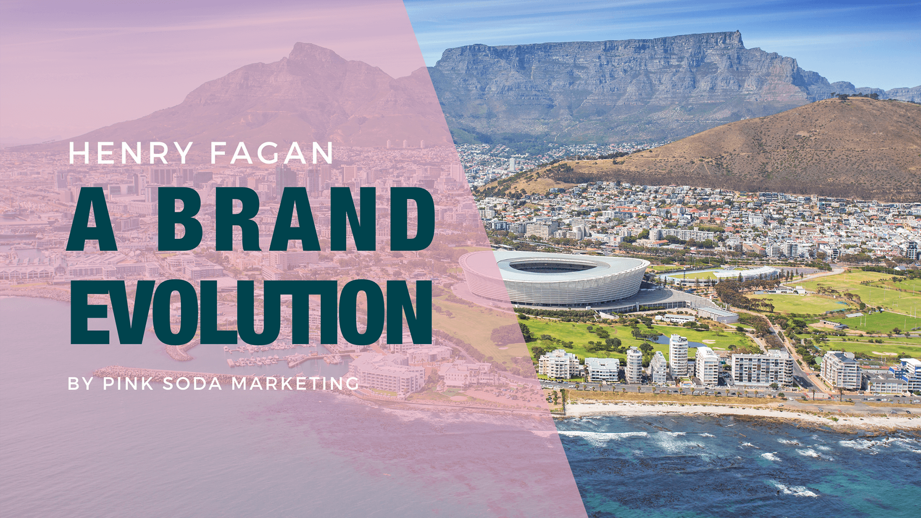
When a brand has become renowned as an iconic contributor in its industry, making changes to the look and feel can be a tricky task.
Go too conservative, and no one notices but go too bold, and everyone starts to pick at the new identity. If a brand’s aesthetic changes too much, people often lose trust in the brand because they no longer resonate with the easily identifiable logo and colour scheme they’ve come to know so well.
When the leaders at Henry Fagan asked us to assist them in uplifting their logo and corporate identity, there were three elements we knew were important to maintain:
- Their brand icon that meant so much to the original team and had become so well known.
- A clean, professional font choice with strong lines that offers maturity.
- The subtle introduction of their new key services “Consulting Engineers & Project Managers”.
Henry Fagan evolved under new leadership earlier this year, and with the introduction of two new directors, came a new range of expertise in the project management division particularly.
Between then and now, several marketing efforts have been put in place to drive action around this new service offering. This included a new company profile design, social media marketing, and updates to their existing website.
“When consulting with the client, we discussed how the business name Henry Fagan & Partners had created an identity that tied it to the original founders and didn’t necessarily emphasise the growth the business had recently undergone.
While the new, extended name “Henry Fagan Consulting Engineers & Project Managers” made it clear that the business had an expansion of services, it was definitely a bit lengthy on the tongue and in documents.
The goal was to reidentify “Henry Fagan” as an organisation rather than a founder lead agency; while upholding the incredible legacy that had been built up over the last 38 years. We chose to soften the focus on Consulting Engineers & Project Managers so that the emphasis was on the name and icon.” Kirsten Maarschalk, Project Head.
The goal was to reidentify “Henry Fagan” as an organisation rather than a founder lead agency; while upholding the incredible legacy that had been built up over the last 38 years. We chose to soften the focus on Consulting Engineers & Project Managers so that the emphasis was on the name and icon.” Kirsten Maarschalk, Project Head.
Working on a project that offers a design challenge and an opportunity to handle multiple aspects of the marketing spectrum is rewarding enough for us, but client satisfaction certainly makes it so much better!
“Given the incredible reputation and credibility of Henry Fagan over the last 38 years, we wanted to ensure that our refresh did not lose any of the attributes attached to the brand. The goal was to move the company branding to a contemporary style which also echoed our new mission, growth, and expansion of services.
”“Given the incredible reputation and credibility of Henry Fagan over the last 38 years, we wanted to ensure that our refresh did not lose any of the attributes attached to the brand. The goal was to move the company branding to a contemporary style which also echoed our new mission, growth, and expansion of services.
Being a Built Environment consultancy, marketing and branding is not typically within our wheelhouse; however, the team at Pink Soda came onboard and drove the process from start to finish in a very professional, collaborative, and enjoyable manner. They provided expert guidance, effective communication and exceptional end products throughout the process and we are quite pleased with the results.”
Lurendrin NaidooOperations Director , Henry Fagan
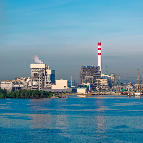
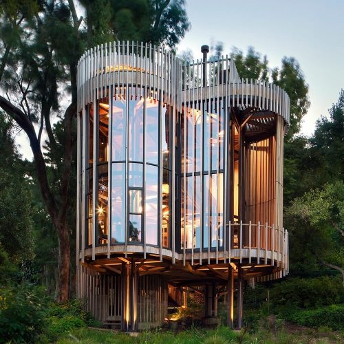
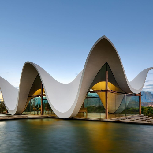
Some of their iconic Projects

It has been an absolute pleasure working with you and the team Kirsten. Looking forward to the future!
Thank you Luren! We look forward to the same!